
Procter & Gamble
Website redesign and product launch
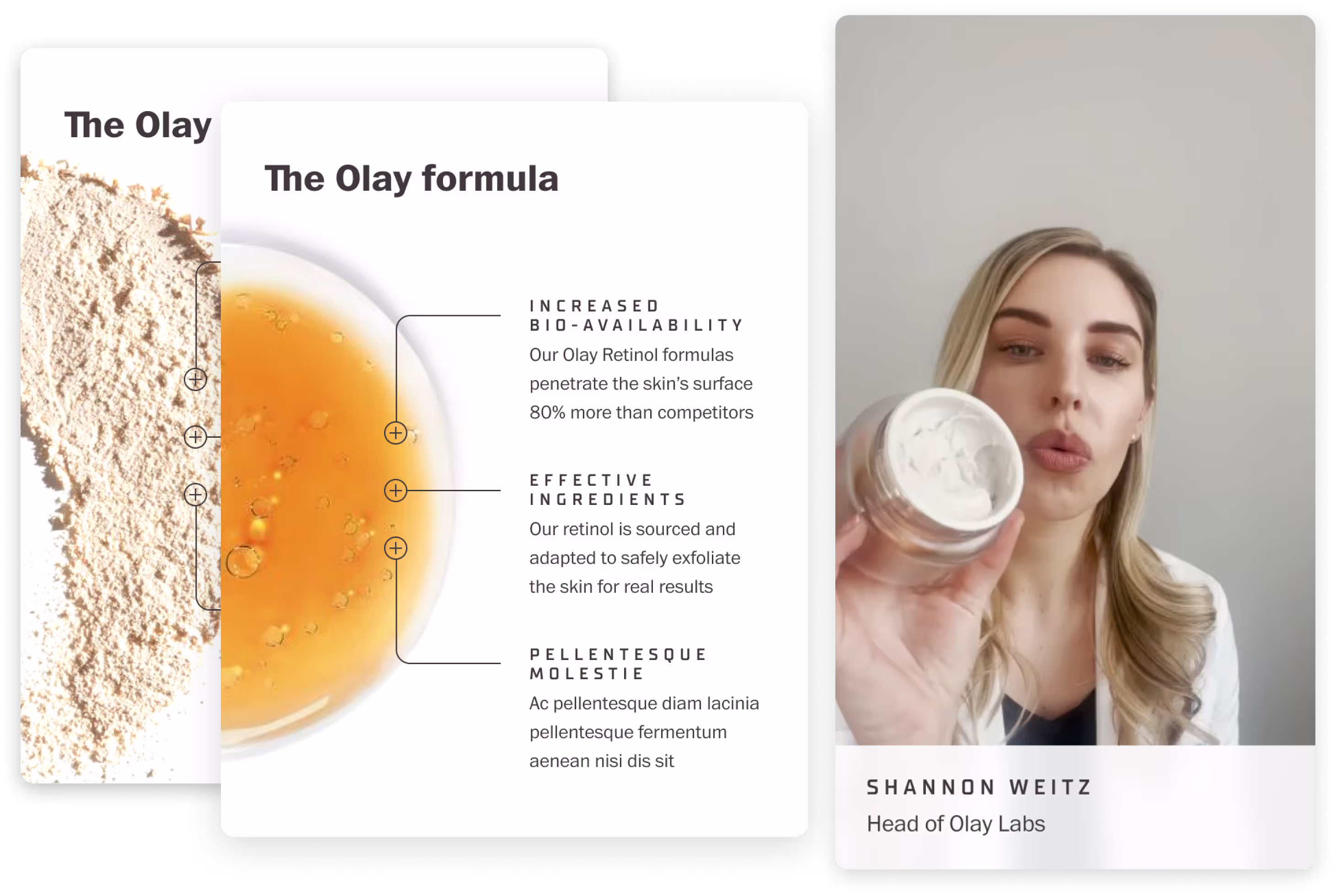
-min.png)
I lead the UX team as we relaunched Olay.com to change the perception of the brand as a “cheap, drugstore” beauty brand to a “proven and effective, science based” beauty brand and appeal to a wider audience.

Procter & Gamble - Olay
UX & Content Strategy
Remote and Cincinnati, OH
Relaunch Olay.com in preparation for the new product launch of a revolutionary new product
Challenge
Stakeholders held the firm belief that users only care about sales and discounts despite user testing proving that users care more about ingredients and their effectiveness. How do we reestablish ourselves as a brand rooted in science while educating users about products/ingredients?
Solution
Shifting from sales to education. Our internal team of scientists had existing demonstration videos, perfect for social media, and clinical studies on the effectiveness of their formulations. We also launched a “Product Finder” feature, and elaborated on different ingredients to help educated users about skincare.

Approach
We tested various homepages and also improved on site navigation to improve the user’s shopping experience. New landing pages and PDPs were also personalized to our users, and we encouraged waitlist signups in order to notify users of our next product drop.

Design
I worked closely with the visual design team to elevate our online aesthetic. We reduced the number of fonts and cleaned up our asset library. We also changed all of our CTAs from red, a color associated with error states, to black.

Outcomes
By launch date, we had achieved the highest number of waitlist sign-ups in Procter & Gamble history. Within the first two hours we sold out of Super Serum. Record sales continued for several months after launch, surpassing even the highest expectations, and setting a precedent for all future product launches company wide.


BlankSpaces
Improving the user experience and redesigning the website for a coworking office space.
View Project